Congratulations – you’ve decided to start using digital signage as a part of your internal communications strategy. Now what?
We always recommend starting with a simple 3-step digital signage content strategy to make sure your content will be relevant for your corporate audience and that they don’t end up simply ignoring it. Once you know what you’re looking to achieve and who you’re targeting with what messages, it’s time to get practical and start creating and sharing content.
To get your message through to your employees, these are the 4 most important best practices in digital signage content and design you’ll want to nail:
- Make your content easy to skim
- Don’t overcrowd your screens
- Keep your content flows short
- Prioritize content based on information needs
P.s. If you’re looking for a digital signage buyer’s guide instead, we’ve also got you covered. If you’re interested in finding the best Chrome or Windows devices, make sure to check out these resources.
Without further ado, let’s get into it.
1. Make your digital signage content easy to skim
Typical issues
Things like too small font or unclear visual hierarchy make it hard for people to understand what point you’re trying to get across and eventually, they stop paying attention to your digital signage content.
By using visual design and typography best practices, you ensure your content draws attention and is easy to understand without having to think too much about it.
How to fix it
- Keep your lines and paragraphs short. If you want to share e.g. PowerPoint slides, you need to do this manually and use two or more columns. When data is automatically pulled from your workplace tools through integrations (e.g. SharePoint updates), formatting like this is typically done automatically and you don’t have to worry about readability.
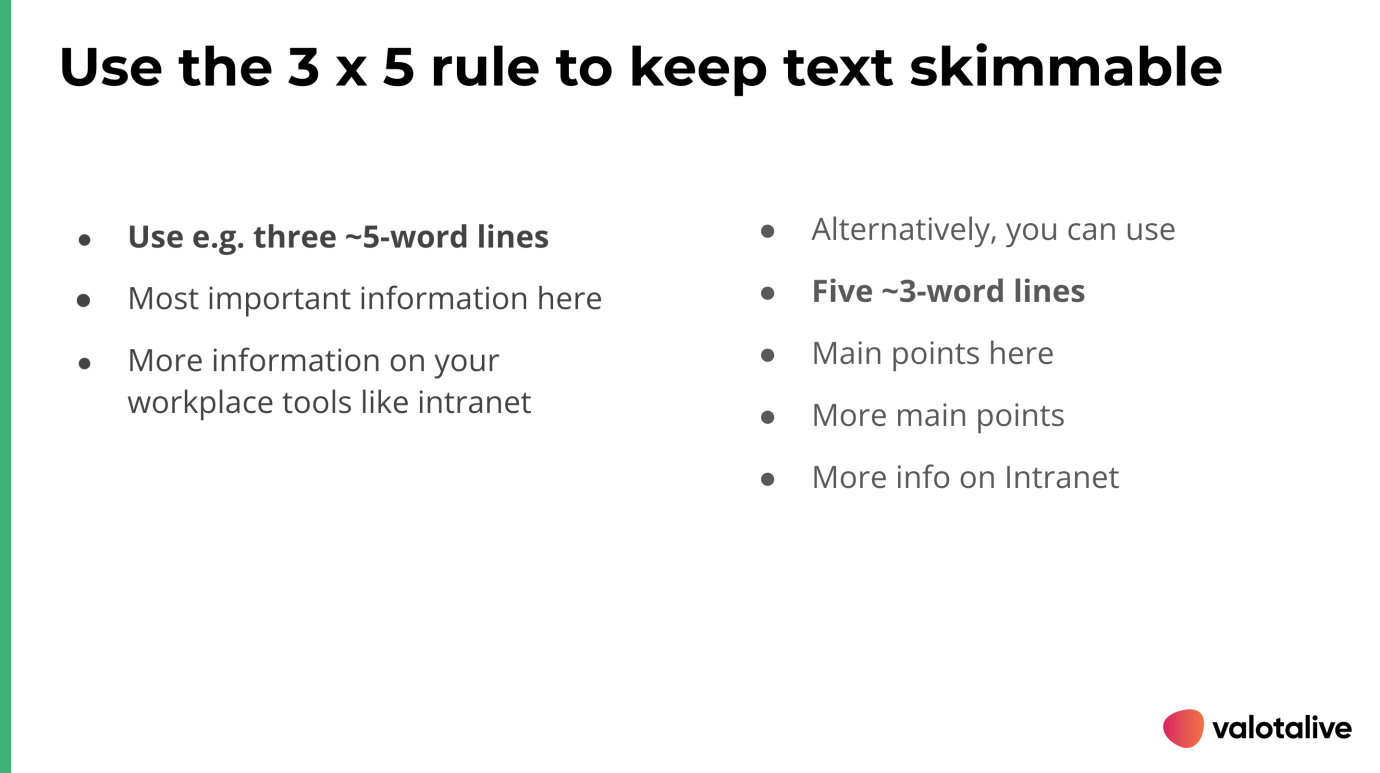
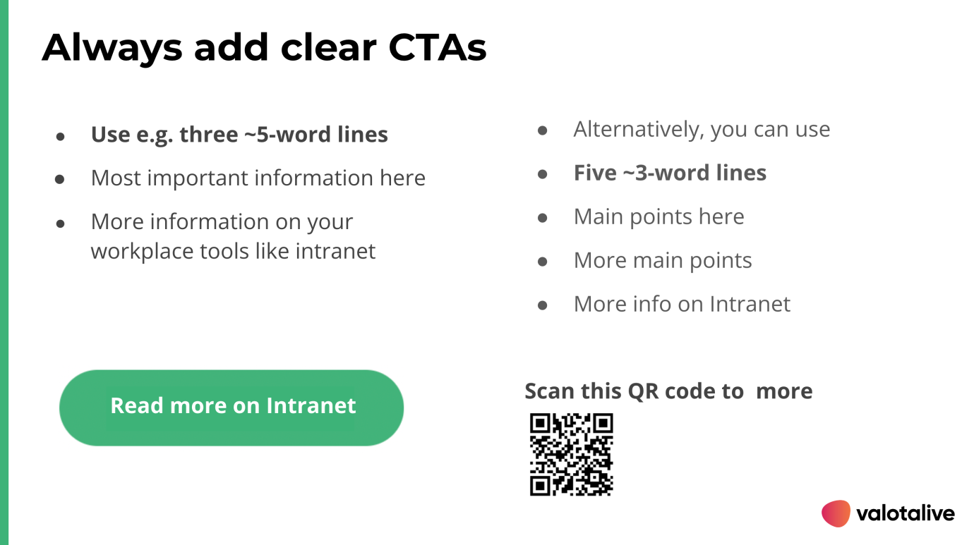
- Keep a strong visual hierarchy with headwinds and bullets. Add clear and concise subheadings (instead of a wall of text), or use bulleted lists – the 3×5 rule suggests you should use either three 5-word lines or five 3-word lines to keep your message skimmable and uncluttered.
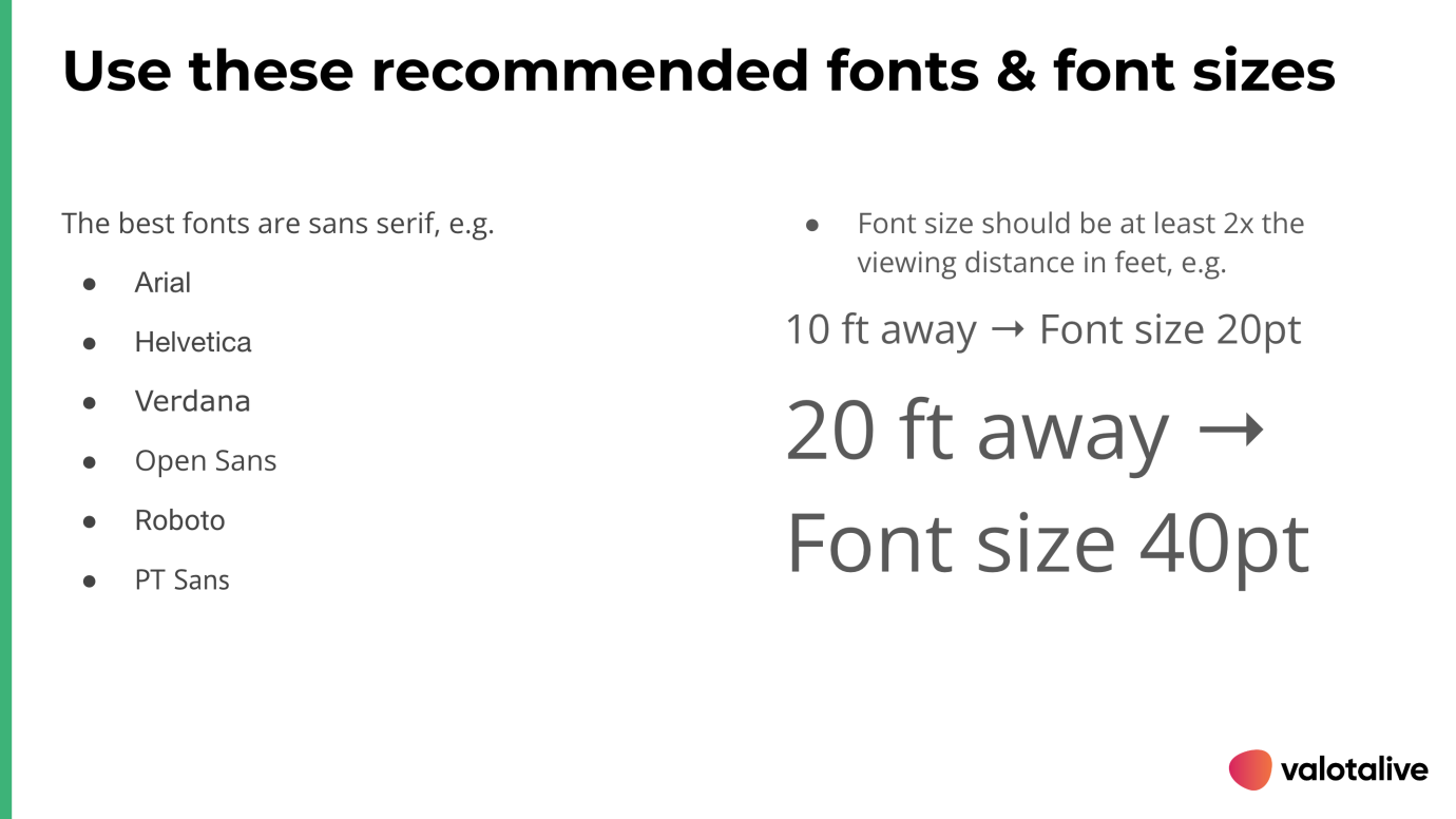
- Use a clear font (and max two different fonts). The best font type for digital signage content is sans serif, e.g. Arial, Helvetica, Verdana Open Sans, Roboto, or PT Sans.
- Use a big enough font size. The ideal font size for a digital signage screen depends on the distance between the screen and the viewer. As a rule of thumb, the font size should be at least 2x the distance in feet. E.g, if your digital signage is 10 ft away, your font size should be at least 20 pt. The farther you go from the screen, the bigger font you can choose (e.g. 50+ ft → Font size can be 3x or even more = 150 pt).
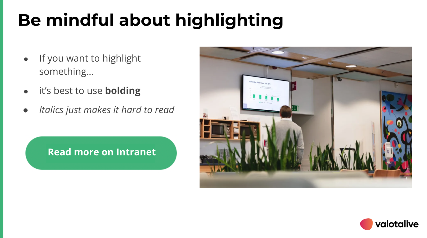
- Avoid italics and weird font shadings. If you need to highlight something and there’s no other way to do it (e.g. use a subheading instead), use bolding.
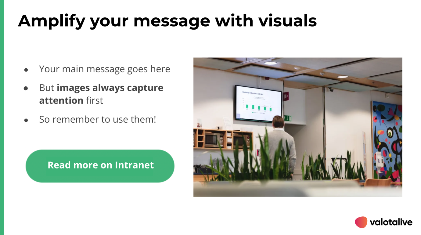
- Use images and icons to make your point. At least half or two-thirds of your content area should be filled with images or visuals instead of just text. In addition to illustrations and images, you can use familiar shapes and icons to draw people’s attention and provide context for your text.
- Use brand elements like colors consistently to have your viewers associate certain topics with specific colors. Valotalive allows you to create handy themes that you can choose from when creating digital signage content.
2. Don’t overcrowd your digital signage screens
Typical issues
Sharing too much information on each screen will make it hard for people to understand what’s really important.
How to fix it:
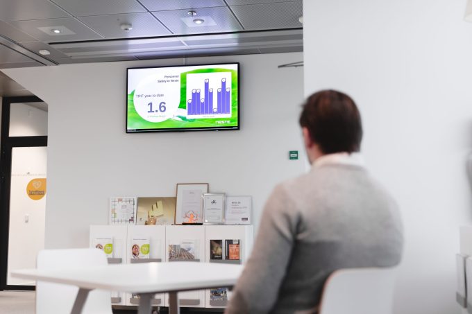
Summarize and shorten your message as much as you can to only include key points. Digital signage is different from many other internal communications tools: it’s a push channel that people come across when doing something else, not a pull channel (like your intranet) that people will specifically log into. When it comes to getting your message through, less is more.
3. Keep your digital signage content flows short
Typical issues
Too long content flows will just bore people out – and soon nobody will pay attention to your digital signage content anymore. This is why you’ll want to keep your content queues as short and relevant as possible.
There are two main reasons why companies end up with too long content flows:
- Trying to include every detail into info screens (e.g. 10 slides about one single topic)
- Trying to communicate everything everywhere (e.g. instead of limiting displaying social media walls on break rooms only)
How to fix it
Only communicate main points – and lead people to other channels for more details. Digital signage may be an excellent medium for reminders, overviews, news, and such – but not so good for in-depth content that people want to dig deeper into, and you shouldn’t treat it as such.
You can do this by adding a relevant CTA (“Read more from Intranet”), allowing people to scan a QR code that opens a link, or using the upcoming Valotalive Control app that allows viewers to temporarily take control of the info screen and open a link from a pre-selected list.
In addition, you should always prioritize content based on contextual information needs. See the next section for personalization.
4. Prioritize digital signage content based on information needs
Typical issues
We hate to break it to you: employees don’t always find corporate digital signage content very relevant to their information needs.
As much as we’d love everyone to embrace our fun employee-of-the-month campaigns, most employees – especially non-desk workers – simply just want to have access to the practical information they need, where they need it, and when they need it.
There are many possible reasons for this:
- Your digital signage software doesn’t support your communication needs. Many old-fashioned options in the market don’t have good enough integration capabilities with your existing workplace tools which results in time-consuming and error-prone manual updates.
- Content displaying frequency and dwell time are not designed based on how important content is to employees.
- Your process didn’t start with creating a content strategy and defining ownership – so nobody in the company really knows what message they’re trying to get through and why, and content is not designed for employee information needs first.
How to fix it
Choose software with direct integrations that allows automated real-time updates. Pulling data or content directly from your workplace tools like Sharepoint or Power BI allows you to display up-to-date information with little to no delay, prioritize updates automatically based on posting time (or based on any other rules you prefer), and so on.
Automated updates are also much less prone to human error (like forgetting to edit, add, or remove content).
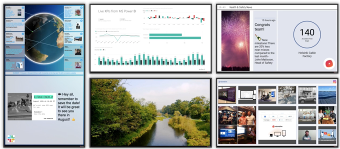
Choose the displaying frequency and dwell time deliberately to match the viewing pattern – don’t just blindly add more content to the queue.
All content is not created equally important – just think how often your employees might want to see day-to-day operational data, high-level summary of your company strategy, or social media walls, and on which info screens (right next to the production line, break rooms, etc.).
With Valotalive, you can give more screen time to the most important digital signage content. These important content pieces can also be displayed for longer if needed. Tip: You can also set periodic visibility to your content based on calendar days to amplify specific content types and ensure better exposure!
Personalize displayed content based on location and employee needs over generic non-targeted communications.
As a rule of thumb, you should always prioritize team-specific communications (e.g. production line operation data) over BU or company-level, more generic communications (e.g. company news or social media walls). People are typically most interested in messages that are either somehow relevant to their day-to-day job or entertaining.
As you can see from this example content mapping table, not all content should be shown everywhere:
| LOCATION | TARGET AUDIENCE | BUSINESS DRIVER | MANUAL CONTENT | AUTOMATED CONTENT |
|---|---|---|---|---|
| All info screens | Non-desk workers in all production facilities | Increase workplace safety and avoid accidents | Accident-free days counter | Health and safety announcements from the company intranet |
| Production line-specific info screens | Teams | increase operational efficiency and spot potential errors | Management announcements related to the achievements and successes of the production line | Production line-specific operational data from the BI System |
| General info screens | Non-desk workers in all production facilities White-collar workers in all offices | Increase data transparency | PowerPoint presentation about production numbers, line statuses and production goals | Real-time sales numbers from Power BI (pre-filtered to show only relevant data) |
| Break room & general info screens | Non-desk workers in all production facilities White-collar workers in all offices | Keep all locations informed and aligned by sharing important company news | Deliver essential news, updates, and content on company best practices | Latest intranet news (most recent first) |
| Break room | Non-desk workers in all production facilities | Increase team spirit and engagement | Local non-work related announcements / posts (e.g local events) published by local employees | Increase engagement by showcasing company culture and displaying achievements with social media feeds |
With Valotalive, this is easy to do either for each display separately or for multiple displays with the ‘display grouping’ option that allows you later target content based on parameters of your choice (e.g. London office, UK, break rooms, external, and so on).
In break rooms, you can show lighter content like social media feeds and employee-of-the-month awards. In production lines, you’d rather display operational data that helps teams increase operational efficiency and spot potential errors before it’s too late.
Note. You can read more in our other guides on Digital Signage Best practices digital signage best practices
Conclusion
When used correctly, workplace digital signage has many business benefits like increasing employee productivity and supply chain efficiency. If you follow these simple yet effective rules of thumb, you’re almost guaranteed to get a better return on investment for your internal digital signage.
Try Digital Signage Today and unlock the Benefits for your Business
Start your free trial and experience the innovative world of Valotalive digital signage for yourself.
Learn more about Valotalive and digital signage use cases.
