Are you looking for information regarding Microsoft Power BI? Would like to learn the best practices for designing great Power BI dashboards and reports? Look no further, we have got you covered!
In this blog, we provide you the summary of the top tips. We also link you with some of the best experts in Power BI. You will find the links to the original articles for further information regarding designing great Power BI Dashboards.
Editor’s Note:
Before we jump into the articles we’d like to note something.
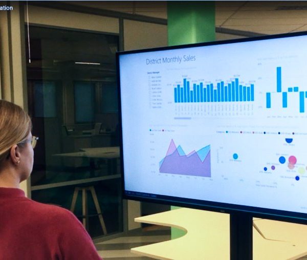
In case you are optimizing a dashboard or a report to be used solely on Digital Signage displays keep these rules of thumb in mind:
- Focus on the most important information
- Have less content
- Use larger fonts
The audience Digital Signage displays are typically looking at the displays from further distances compared to the laptop.
Make the content stand out and easy to view. Using larger fonts also forces to minimize the amount of content – circling back to rule number one
Without further ado, let’s dive right in and take a closer look at the tips and articles that help you to design great dashboards and reports.
Guy in a Cube
Make your Power BI report POP with a custom background
Often times the difference between someone using your report and not consuming your report is the way it looks. In this video, Patrick gives you a simple tip to use a background image that makes the report POP and nice, something that people want to look at. Take a look at this video. This might just do the trick
Guy in a Cube is a popular YouTube channel that helps you master Business Analytics on the Microsoft Business Analytics stack.
Microsoft Docs
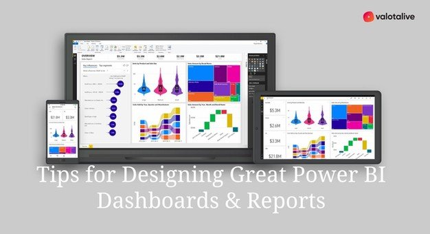
Tips for Designing Great Power BI Dashboard
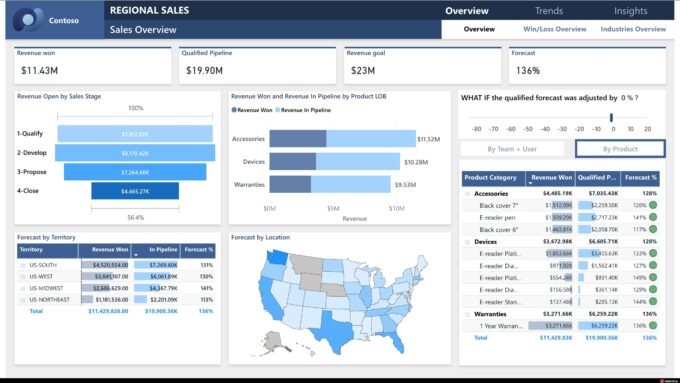
This article, by several contributors, will help you make the most important information stand out, and make the dashboard clean and uncluttered.
The summary of the top tips in this article are:
- Consider your Audience
- Tell a Story on One screen
- Make use of full-screen mode
- Accent the most important information
- Place the most important information
- Use the right visualizations for the right data
They also have further links to a white paper and a video in the article.
The entire article can be found here: Tips for Designing a Great Power BI Dashboard
sqlbi
The 15 rules to design a perfect dashboard
Marco Russo gives you Power BI design best practices in this webinar recording.
The summary of the design best practices are:
- Design for a target
- Keep everything at a glance
- Keep it simple
- Align elements
- Be consistent
- Highlight the most relevant information
- Be clear
- Start from zero
- Shorten the numbers
- Show the context
- Choose the right colors
- Design dashboards, not reports
- Show variations
- Leave the noise off
- Pick the right parts
You can find the webinar in its original location here: The 15 rules to design a perfect dashboard
SoftwareOne
5 Power BI Tips To Make Your Reports More Appealing And User-friendly
In the original article the editorial team from SoftwareOne gives you 5 tips on how to make the most of your Power BI Reports.
The summary of the tips:
- Simplicity – don’t go too fancy with Visualizations
- Context – Interrelations between elements
- Divide and conquer (or slicing and dicing) – filtersHigh or Low perspective – hierarchies
- Meaningfulness – think about the message rather than the graphics
The entire article can be found here: 5 Power BI Tips to Make Your Reports More Appealing and User-friendly
P3 Adaptive
My Top 5 Power BI Visual Design Practices: Transforming Good to Great
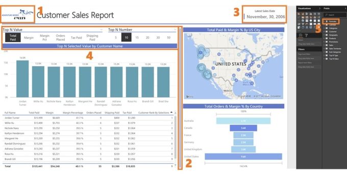
This blog post by Kristi Cantor offers you 5 concrete tips that will help to make sure your Power BI Report looks good, tells a story, pops, or his personal favourite “is aesthetically pleasing”
The summary of the tips in the article:
- Company logo
- Lines to help divide sections of the report
- Data timestamp to show how recent the refresh was
- Report formatting
- Dedicated DAX measures table
The entire article can be found here: My Top 5 Power BI Visual Design Practices: Transforming Good to Great
Further Reading you might find interesting
