
By Tomi Paajanen, CGO and co-founder, Valotalive
In one of our recent customer conversations, a manufacturing operations lead showed me what their daily tier meeting actually looks like. A whiteboard. A few printed Power BI dashboards inside plastic sleeves. A binder. A laminated SQCDP grid. The team has been running this meeting every morning for years. It works.
The thing that didn’t work: the data was already a day old by the time they were standing in front of it.
That moment sits inside a corner of our industry most commentary skips. When people talk about “digital signage,” they usually mean ad displays in supermarkets, stadiums, airports, or hotel lobbies — B2C content played to consumers walking past. That’s a different business, a different buyer, and a different product than what we build.
We work in a different segment: B2B, non-desk, operations. Screens mounted in factories, production sites, logistics yards, distribution centers, and warehouses — for frontline workers without company laptops and no inbox to put a KPI in. Inside that segment, we’ve been through three distinct shifts in what our own product is for. Each one was driven by the same kind of customer asking for something the category couldn’t do yet. Here’s how the three phases played out for us.
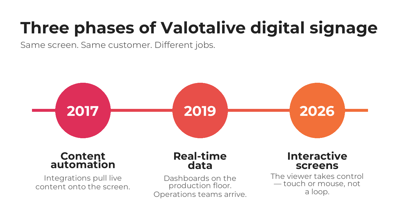
Phase 1 (2017): Content Automation (and the Decision Not to Do Ad Displays)
When we launched Valotalive in 2017, our differentiator was simple. We automated content. Communications, HR, and internal teams could pull live information from the systems they already used — SharePoint, Happeo, social media, weather feeds, news, lunch menus, traffic info — straight onto the screen on the wall. They didn’t have to rebuild it manually. They didn’t have to hire someone whose job was to keep the loop fresh.
We also made a decision early on that I think shaped everything that came afterward: we don’t do ad displays. The entire digital signage industry was built around advertising. Most of the tooling, the business models, the use cases — all designed around selling someone else’s attention to someone else’s brand. We chose to focus only on internal company communication. The viewer of our screen is not a consumer being marketed to. It’s a worker, an employee, a colleague.
That decision narrowed the market. It also clarified everything about who we were for.
Phase 2 (2019): The Power BI Moment: Giving People Access to Live Data
In 2019, we launched our first data integration: Microsoft Power BI. Then Excel, Data Transfer API, SAP Analytics Cloud, and others followed. Power BI was the one that took off fastest. It became one of our most popular and most business-critical apps almost immediately.
What surprised us at the time wasn’t the technical adoption. It was the new kind of person showing up in our trial pipeline. Operations managers. Quality managers. Safety managers. BI teams. People who had no opinion about internal communications platforms — and a very strong opinion about whether their KPI dashboards could land on a screen on the production floor.
We realized that the same screen on the wall could do two completely different jobs. The communications team kept their always-on content. The operations team layered live business data onto it. Same screen. Same software. Two solution areas, in the same physical space.
Phase 3 (2026): The Viewer Takes Control
For most of the time since, the most consistent customer feedback has been the same thing: the viewer has no control.
You can centrally manage content. You can automate it. You can publish manually. You can mix communication and data on the same screen. But the person in front of the screen still has to wait for whatever loops past. If the loop has 37 slides at 15 seconds each, and the slide that actually matters to them is slide 18, they walk away with their coffee before they ever see it.
This year we launched the third phase: Interactive Notice Board and Digital Tier Board, both built on overlay technology our product team developed. Now the viewer can touch the screen — or use a mouse — and take control of what they see. The publisher still decides what’s available. The viewer decides what they actually consume.
For comms-led use cases, this changes the dynamic in break rooms, lobbies, visitor centers, and offices. People stop being passive watchers and start being active readers.
For operations-led use cases — which is where I’ve spent the most time recently — the change is bigger. The Digital Tier Board takes the same SQCDP structure that operations teams have been using since Lean management became common, and turns it into a live, interactive workspace. Real-time data on the same screen the team is already standing in front of. In the next version, the team will be able to write deviations directly on the screen, log root causes, and assign action points without leaving the meeting.
What This Pattern Actually Is
Here’s the pattern I keep seeing across all three phases.
Each one wasn’t really about adding a new feature to a product. It was about closing a gap between what the screen could do and what the work actually required. In 2017, the gap was effort: keeping a screen current was too manual. In 2019, the gap was relevance: comms content alone wasn’t enough for an operations audience. In 2026, the gap is participation: a passive viewer can’t act on what they see.
What stayed constant through all three is the customer’s underlying goal. Operational excellence. Every customer we’ve talked to over the past seven years is, in some form, trying to run their operations a little better tomorrow than they did today. The screen on the wall is a tool in service of that. The product just keeps catching up to it.
| Dimension | Traditional digital signage | Signage as interactive operational workspace |
|---|---|---|
| Primary question | How do we communicate to people? | How do we let people work with live data? |
| Direction of flow | One-way broadcast | Two-way exchange |
| Audience role | Passive viewer | Active participant |
| Content source | Centrally published, pre-approved | Team-layered — comms + real-time data + input |
| Data freshness | Scheduled or looped | Real-time |
| Interaction model | No control — watch what loops past | Touch or mouse — viewer takes control |
| Primary user | Communications, HR | Operations, quality, safety, BI |
| Typical setting | Lobbies, meeting rooms, retail, ads | Shop floor, production lines, ops rooms |
| Success signal | Impressions, reach, dwell time | Operational improvement, deviation tracking, action-point follow-through |
Where I Think B2B Non-Desk Signage Goes Next
Beyond our own roadmap, here’s where I think the category is heading — this part is prediction, not history.
I think the next version of B2B “digital signage” will be hard to recognize as digital signage at all. The word started out meaning “screen on a wall showing content.” It’s becoming “shared interactive surface that an operations team uses to run their work.”
That’s a different category of product. It uses many of the same building blocks — content management, integrations, hardware, software — but it’s pointed at a different question. Not “how do we communicate to people?” but “how do we let people work together with live data, in the physical room where the work happens?”
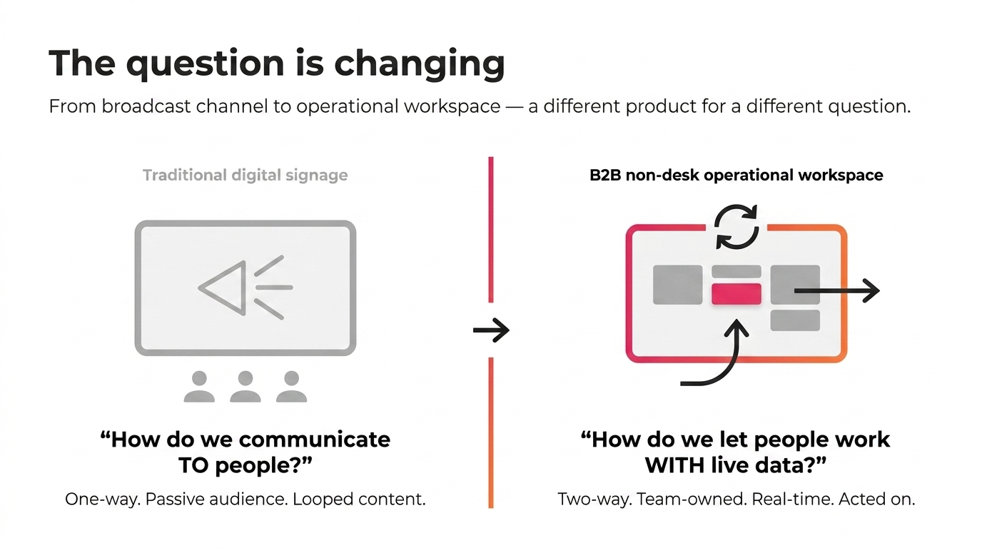
We’ve built our last seven years on the answer to the first question. The next several will be about the second one.
The morning meeting doesn’t need to change. The data underneath it does. The screen on the wall doesn’t need to disappear. It just needs to start participating in the work.