
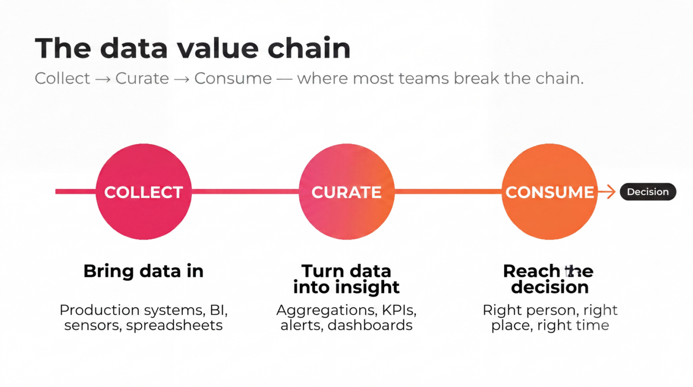
The data value chain is the path data takes from collection to decision — the steps and handoffs that turn raw operational data into action by the people who need it. Done well, it produces a real connection between data and value: every dataset moves toward a decision someone will actually make. Done poorly, data accumulates in dashboards no one opens.
Most teams have already invested in collecting and curating data. The breakdown happens at the last step — consume — where insights need to reach the people who decide things. This piece is about where that gap usually opens and what closing it actually looks like.
By Kaijus “Kuju” Asteljoki, Co-founder and Product Lead at Valotalive.
A few Saturdays ago a friend dropped by for coffee. We were drawing diagrams on a piece of kitchen paper before we noticed the morning had gone. He runs operations at a mid-size manufacturer; I run product at Valotalive. The conversation went where they all seem to end up these days: most companies have invested in data, and most of them are losing value at the last step of the chain — where decisions are supposed to happen, but the insights never arrive in time or at the right place. That conversation is why this piece exists.
What is the data value chain?
The data value chain describes the full path data takes inside a business — from the moment it is collected to the moment a person uses it to make a decision. Value is added at each stage, and value is lost at every broken handoff. A well-functioning chain produces a clear connection between data and value; every dataset terminates in a decision a person actually makes.
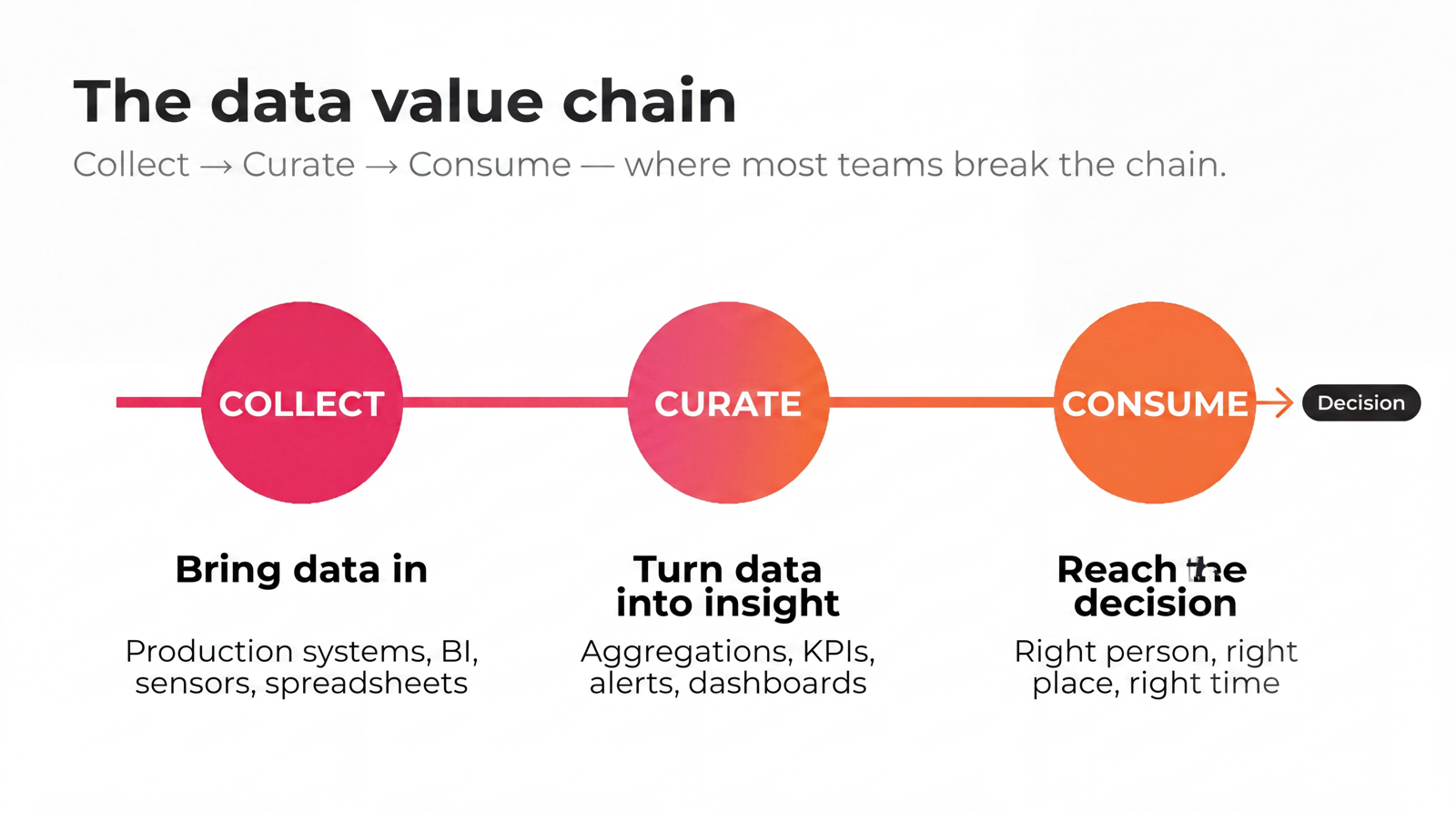
Across most operations teams, the chain has three connected stages:
- Collect — bring in data from production systems, BI tools, sensors, spreadsheets, and people, in formats and at the speeds the business actually needs. The goal here is coverage and quality, not yet usability.
- Curate — turn raw data into actionable insight: aggregations, KPIs, alerts, dashboards, signals tied to specific decisions. This is the work most BI teams already do well.
- Consume — deliver those insights to the right people in the right place at the right time, in a form they can act on. This is where most organizations break the chain.
“When your capture, curate and consume process begins to tick like clockwork, data empowers you to build new offerings and disruptive business models.”
— Sanjeev Vohra, Global Lead, Technology, Accenture
Most data investment goes into Collect and Curate. Consume is treated as someone else’s problem — usually because the audience for consumption isn’t sitting in front of a Power BI license. Closing the chain at the consume step is where the information value chain actually becomes useful.
Why does the data value chain matter for operations teams?
Operations is the part of the business where the gap between knowing and acting is shortest. A shift supervisor seeing live production data on the floor can act in five minutes. The same data, buried in a dashboard that needs a laptop, login, and browser tab, may not be acted on at all that day.
That makes the data value chain not an analytics question but a decision-flow question. The point is not how much data you produce. The point is how much of that data ends up shaping a decision someone makes in the next hour, shift, or week.
Industry research consistently links data-driven performance with revenue and margin advantages. What that research understates is where the gap between leaders and laggards actually sits: not at collect, where everyone has invested, but at consume — where the chain ends and decisions begin. Operations teams that move information faster from collection to action build a more sustainable value chain — the kind of operational excellence that survives reorgs, scales with the business, and grows with the team using it.
Where do most organizations break their data value chain?
Two failure patterns repeat across industries.
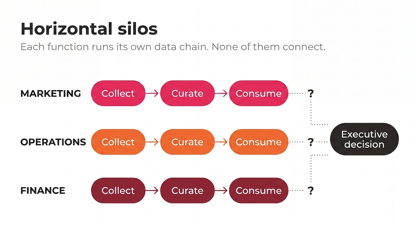
Horizontal silos: data confined to one function
Marketing has its dashboards. Operations has its dashboards. Finance has its dashboards. Each function reports up, separately, to executives who try to reconcile them in a Monday meeting. The data is all technically there — but the chain runs in parallel streams that never connect. A change in customer demand visible in marketing isn’t seen by production until the next planning cycle. Decisions get made on the function-local picture, not the company picture, because the information value chain never crosses the boundary.
Vertical silos: data confined to the people who built it
Even within one function, the people who built the dashboards aren’t usually the people who need to act on them. A BI analyst owns the Power BI model. A maintenance technician needs to know whether a line is running. If the only path between them is a meeting or an emailed PDF, the value chain is broken — not because the data is wrong, but because it never arrives where it’s needed in a form that can be used.
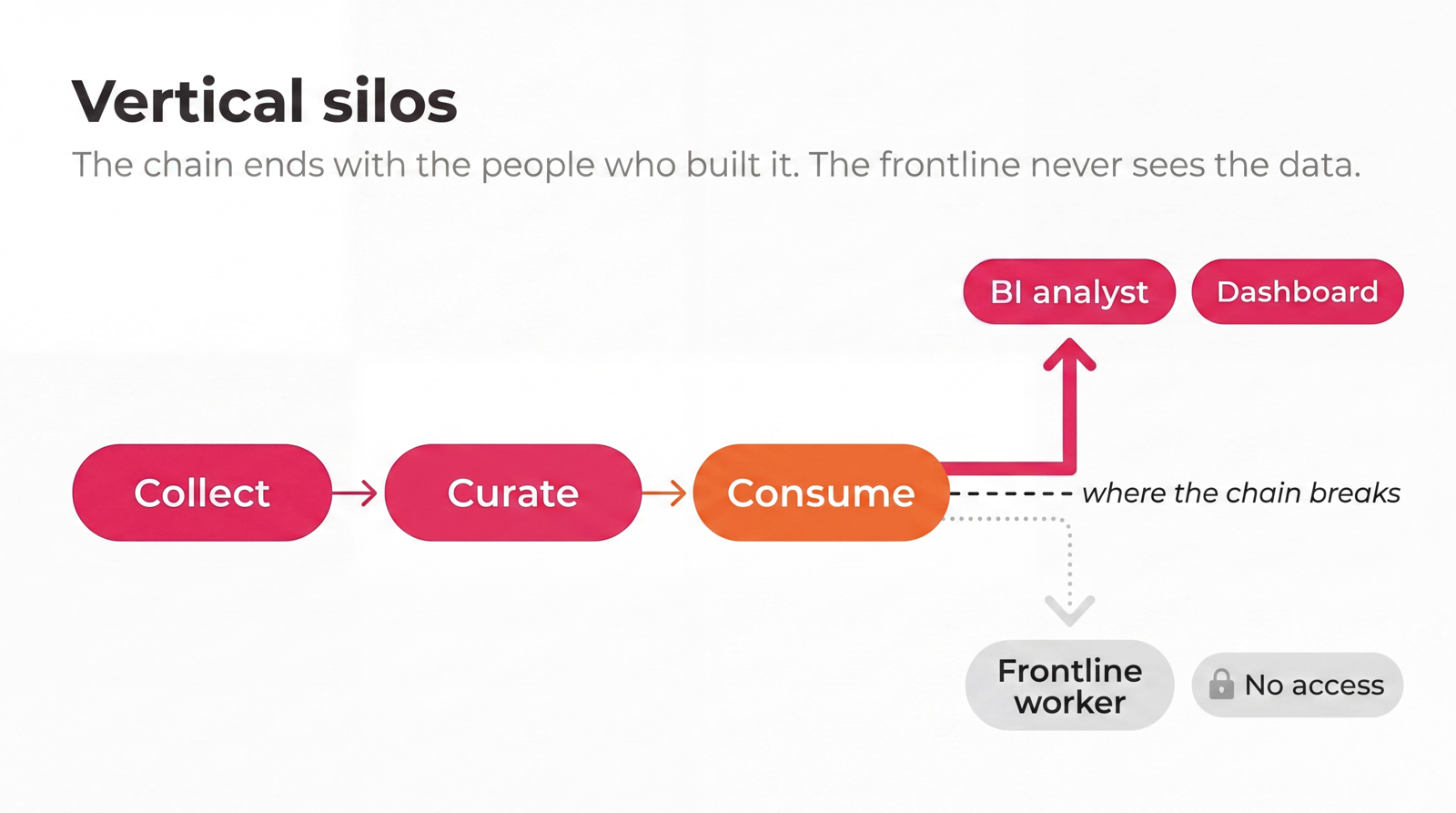
Both failure modes have the same root cause: the consume step is treated as someone else’s problem. A sustainable value chain for data requires deliberate design at consume — not just at collect and curate.
How do you optimize your data value chain end-to-end?
Optimizing the data value chain is less about adding tools and more about closing the gaps between the stages you already have. Five practical moves consistently separate the chains that produce decisions from the ones that produce dashboards.
- Map each dataset to a decision. Every dataset on the chain should answer: which decision does this exist to influence, and who makes that decision? If a dataset doesn’t terminate in a decision, it isn’t part of the chain — it’s overhead.
- Push insights to where decisions get made. For operations teams, that’s almost never a desk. Shop floors, control rooms, warehouses, and distribution centres are where production and quality decisions happen. Insight that doesn’t reach the point of decision doesn’t close the chain. Digital signage for manufacturing exists for this exact reason.
- Choose visibility modes that match the work. Some data needs to be ambient — always visible, always current, like live production dashboards. Other data needs to be on-demand — explored interactively when something changes, like in shop floor meetings or tier meetings in manufacturing. The right chain uses both modes deliberately, not by accident.
- Honor access controls at the display layer, not just at the source. Apply Power BI filters per display or screen group, and each team sees only its own slice of a shared report — the right data on the right screen, without standing up a separate report for every site.
- Refresh on the cadence the decision needs. A shift handover needs real-time. A monthly review needs accurate aggregates. Confusing the two is one of the most common reasons an analytics investment fails to produce value.
The combination of these five moves is what makes the difference between data that produces reports and data and value that show up on the income statement.
How does Valotalive close the consume gap in your data value chain?
Valotalive is built specifically for the consume step. The product lets operations and BI teams deliver live data to the screens, locations, and audiences where decisions happen — without rebuilding the underlying BI stack.
- Live integrations. Put the BI stack your teams already run — Power BI, SAP Analytics Cloud, and Excel — straight onto the screen, with authentication and report filters honored: the dashboard a manager sees on a laptop is the dashboard a shift team sees on the wall. SharePoint, Microsoft Teams, and Google Sheets come through the same way, so intranet news, channel updates, and live KPIs land on the floor alongside the numbers.
- Always-on and interactive. A display can show live production KPIs around the clock and, with the Digital Tier Board overlay, turn interactive on touch or click for shift huddles and tier meetings — one screen, both jobs.
- Screen-group targeting. Roll out the right view to the right place. The finishing line sees finishing data. The pack-out cell sees pack-out data. That reduces the noise that erodes attention on shared displays.
- Device management built for non-desk environments. Chrome OS players enroll, update, and report in centrally — zero-touch, through Google Device Manager — while Windows players run in locked-down kiosk mode. The display layer is treated as IT infrastructure, not as ad-hoc TVs in a meeting room.
- Designed for people who don’t sit at desks. The customers who get the most value from Valotalive aren’t BI analysts — they’re the front-line teams whose decisions never make it into a dashboard but absolutely belong in the value chain.
What this looks like in practice
When Rexel needed to bring live Power BI production data to its German shop floor, the upstream chain was already in place — the BI work had been done. The breakdown was at consume: the data wasn’t reaching the people running the line. Valotalive closed that gap without re-architecting the BI stack. Read the Rexel case study.
Start closing the gaps in your data value chain
Most companies don’t need more data, more dashboards, or another platform. They need their existing data to reach the people who decide things — in real time, in the places where decisions happen.
The fastest way to test that is to put your live Power BI, SharePoint, or operations data on a screen where your team can act on it. Valotalive’s Digital Signage Software lets you try this end-to-end in your own environment in under an hour. No credit card.
About the author
Kaijus “Kuju” Asteljoki is co-founder and Product Lead at Valotalive. He works directly with customers on data-driven manufacturing and operations use cases. See About Valotalive.